Our hallway has been in need of a bit of a makeover since we moved into our 70s bungalow two years ago. My plan has always been to inject lots of colour into this space. In my eyes, a hallway should have that wow factor as it’s the first space people see when they walk into your home. As you all know, I live by the mantra that ‘life’s too short for beige’ and I will always endeavour to add as much colour as I can into every space in our small but sweet abode. The colourful and fun decor makes my family and I really happy and lifts our spirits, in my opinion, a room full of bright bold hues can spark joy and add lots of personality and character to a home.

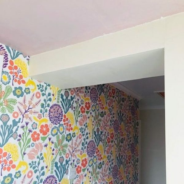
A couple of months ago we decided to remove the original anaglypta in our hallway and replace it with some amazingly vibrant Borastapeter paper. As striking as this was I felt there was still space for more colour and character on the walls so I decided that I would paint all of them in beautiful shades to match the colours in the floral design.


I started following the fabulous paint brand Craig and Rose on Instagram a few months ago and have since been admiring their gorgeous product ranges and colour palettes, so I was thrilled to bits when they recently approached me to partner with them and take part in their ‘#followyourtrend’ campaign.
Before starting this project I did some research on the brand as I was really interested to find out when they launched as a business and where they were based. Did you know that Craig and Rose were two Scottish entrepreneurs (James Craig & Hugh Rose) who established their company all the way back in the 1820s? And did you know that one of their contracts was the Forth Rail Bridge for which they provided the paint over 100 years ago? This I found most inspiring for two reasons; I’m a born and bred Scot and I also live in a seaside village that overlooks this iconic bridge.

Within just a few days of Craig and Rose getting in touch, I received their vintage 1829 collection chart through the door which features the most amazing selection of stylish, bold and mood-lifting colours. I was straight away sold on their products and couldn’t wait to get started with my project.

I started my Craig and Rose decorating journey with a visit to their fabulous store in Stockbridge. I was blown away by the number of colour options. It was like stepping into a sweetie shop! Stephen and Chrissy offered professional expert advice and they took time to help me to select a range of potential shades for my project.


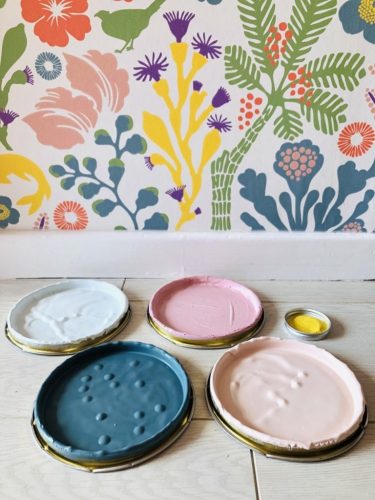
When I got home that night I painted all of my cards with the chalky emulsion samples I was recommended and ran a little poll on Instagram with my followers to help me to decide which colours to paint each area of the hallway. So, in the end, it was decided that I would paint the back wall using Rose Pink and Porcelain blue, the doors in Lamplighter and the entrance area in the Saxe Blue and Alhambra Stone.


The first part of the process was painting Lottie’s door in the chalky emulsion lamplighter. First, I gave it a coat of Craig and Rose light grey all-purpose undercoat, recommended to me by Stephen at the Stockbridge store. I was instantly impressed with how easy it was to apply the paint and also how great quality the brush was. I then proceeded to paint the door with the Lamplighter and gave it two coats. It turned out so well I decided to paint all of the doors yellow!
The next step was to create a colour-blocked design on the back wall. I’ve always been a fan of colour blocking. When I was a little girl I recall my great auntie May, who stayed in a tenement flat in Dundee, had the most fabulous retro colour-blocked design on her stairwell. I reckon the things you see in your childhood definitely inspire you without you fully knowing it at the time. I firstly masked out the area using frog tape and started blocking in the top section with two coats of the chalky emulsion Rose Pink. Next, I blocked in the bottom section with two coats of the chalky emulsion Porcelain Blue.

I feel the Rose Pink, Porcelain blue teamed up with the Lamplighter really complement one another and they tie in with my wallpaper just perfectly without being too punchy. The colours remind me of a packet of Swizzles Fizzer sweeties!The last part of the decorating process was to paint the hallway entrance and ceiling in the chalky emulsion Saxe Blue, Alhambra Stone and Lamplighter. I’ve always loved this beam, it’s the quirkiest part of our home and painting it in these shades has added even more character to this space!

Craig and Rose paints have been a joy to work with for many different reasons:
- You can use them on all surfaces, skirting, walls, ceilings. You can also apply to wooden furniture so it’s perfect for upcycling. If doing so make sure you use one of their great quality primers/undercoats.
- They are so smooth and thick in consistency and the finish is really even, no brush strokes in sight!
- The paints are fast-drying, I only had to leave the walls for an hour or two in between coats.
- They don’t have a strong smell, I was able to paint my daughter’s door in the afternoon whilst she was at her grandparents.
- Their range of colours is vast, you’ll always find what you’re looking for!
Craig and Rose paints have illuminated our hallway and made our home even more joyful. I have lots of plans for using their products again in the future, the next one being painting an old pair of ladders for the hallway gallery wall (phase 2) – so do watch this space on that!
Rachel x x
This post is sponsored by Craig & Rose. For more about Craig and Rose and the option to order a colour book click here.


2 responses
Where is this lovely wallpaper from? Thanks!
Hi Victoria,
It’s from Borastapeter, it’s called Ravdunge.
Many thanks,
Rachel